|
The Background
I used to work for a hotel booking company. Last time, I created some simple visualizations with `ggplot2` to give the stakeholders quick insights into the data. Now, I am interested in creating visualizations that highlight different aspects of the data to present to the stakeholder. I am going to create new kinds of visualizations like bar charts. Step 1: Import data You can download this data set. In the code below, I use the `read_csv()` function to import data from a .csv in the project folder called "hotel_bookings.csv" and save it as a data frame called `hotel_bookings`:
Step 2: Look at a sample of the data
Use the `head()` function to preview the data:
Use `colnames()` to get the names of all the columns in the data set. Run the code below to find out the column names in this data set:
Step 3: Install and load the 'ggplot2' package
Run the code below to install and load `ggplot2`.
Step 4: Making a Bar Chart
The stakeholder is interested in developing promotions based on different booking distributions, but first they need to know how many of the transactions are occurring for each different distribution type. I can tell `ggplot()` what type of chart I want to create by using the `geom_` argument. Previously, I used `geom_point` to make a scatter plot comparing lead time and number of children. Now, I will use `geom_bar` to make a bar chart in this code: 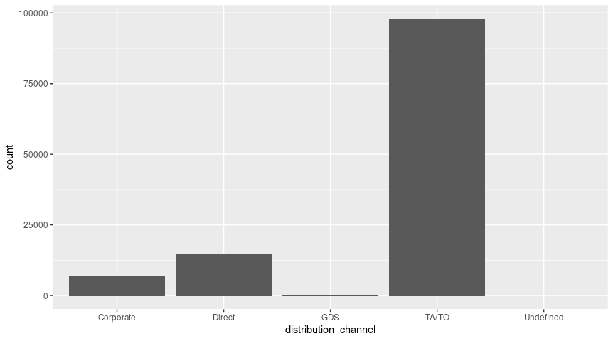
Previously, I created scatter plots with ggplot2. This code creates a bar chart with 'distribution_channel' on the x axis and 'count' on the y axis. There is data for corporate, direct, GDS, TA/TO, and undefined distribution channels.
Step 5: Diving deeper into bar charts After exploring the bar chart, the stakeholder has more questions. Now they want to know if the number of bookings for each distribution type is different depending on whether or not there was a deposit or what market segment they represent. Try modifying the code below to answer the question about deposits by adding 'fill=deposit_type' after 'x = distribution_channel': 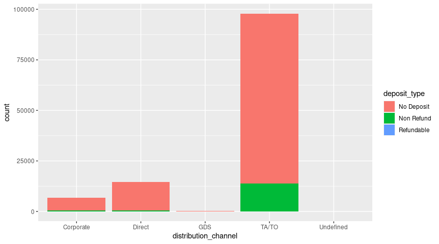
This code also creates a bar chart with 'distribution_channel' on the x-axis and 'count' on the y axis. But it also includes data from 'deposit_type' column as color-coded sections of each bar. There is a legend explaining what each color represents on the right side of the visualization.
Now try adding 'fill=market_segment' to this code instead of 'fill=deposit_type': 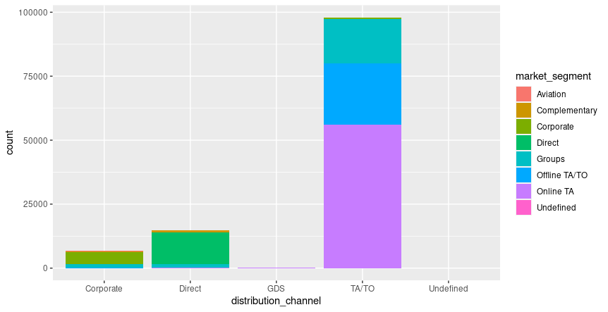
This bar chart is similar to the previous chart, except that 'market_segment' data is being recorded in the color-coded sections of each bar.
Step 6: Facets galore After reviewing the new charts, the stakeholder asks me to create separate charts for each deposit type and market segment to help them understand the differences more clearly. I know that the `facet_` function can do this very quickly. Add 'deposit_type' after the '~' symbol in the code below to create a different chart for each deposit type: 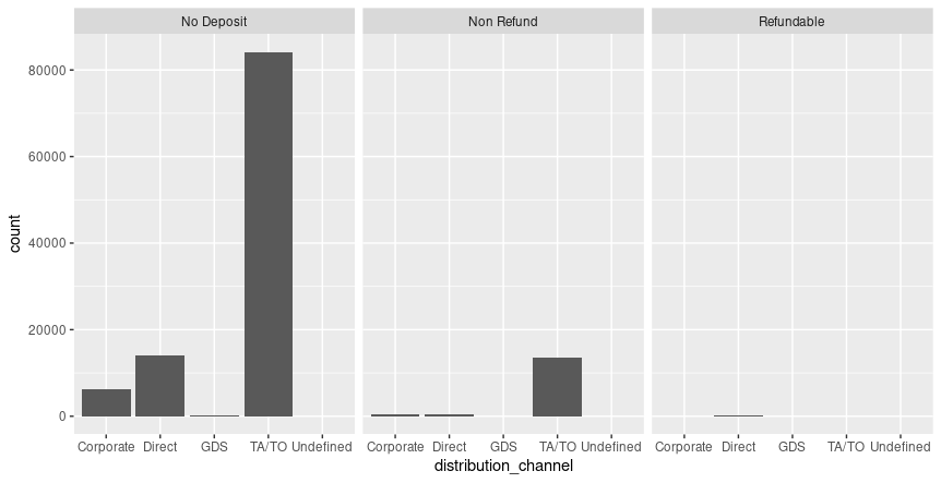
This code creates three bar charts for 'no_deposit', non_refund', and 'refundable' deposit types.
I can use the same syntax to create a different chart for each market segment: 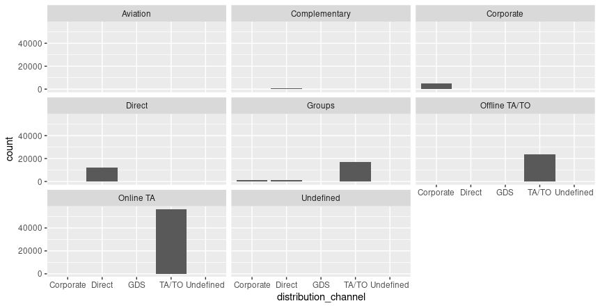
Now, I could put all of this in one chart and explore the differences by deposit type and market segment.
Run the code below to find out; notice how the ~ character is being used before the variables that the chart is being split by: 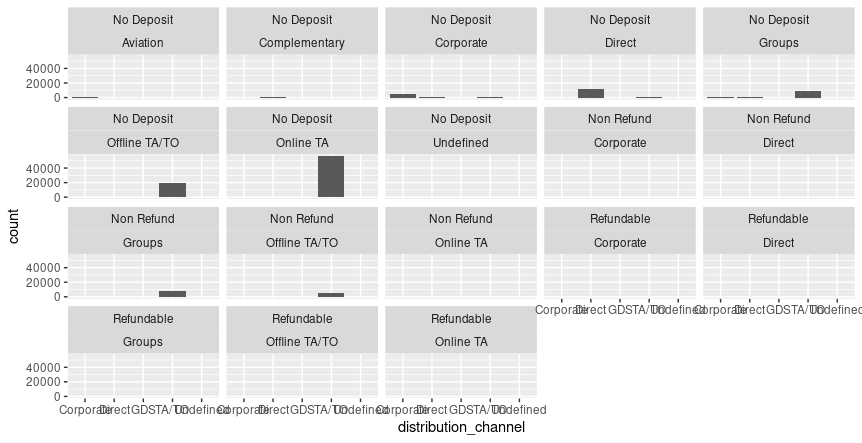
These charts are probably overwhelming and too hard to read, but it can be useful if I am exploring the data through visualizations.
TAGS :
Comments are closed.
|

ISRIL CANIAGONEED HELP?
Please feel free to reach out to me if you have any questions
Categories
All
|
 RSS Feed
© 2017 Isril Caniago. All rights reserved
