|
The Background
I used to work for a hotel booking company. I have been asked to clean hotel booking data, create visualizations with `ggplot2` to gain insight into the data, and present different facets of the data through visualization. Now, I am going to build on the work I performed previously to apply filters to the data visualizations in `ggplot2`. Step 1: Import data You can download this data set. In the code below, I use the `read_csv()` function to import data from a .csv in the project folder called "hotel_bookings.csv" and save it as a data frame called `hotel_bookings`:
Step 2: Look at a sample of the data
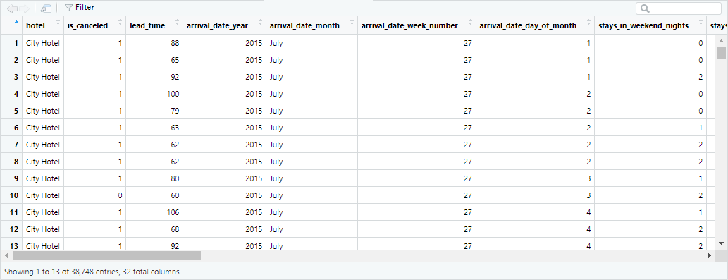
Use the `head()` function to preview the data:
Use `colnames()` to get the names of all the columns in the data set. Run the code below to find out the column names in this data set:
Step 3: Install and load the 'ggplot2' package
Run the code below to install and load `ggplot2`.
Step 4: Making many different charts
Earlier, I created a scatterplot to explore the relationship between booking lead time and guests traveling with children. Here's the code: 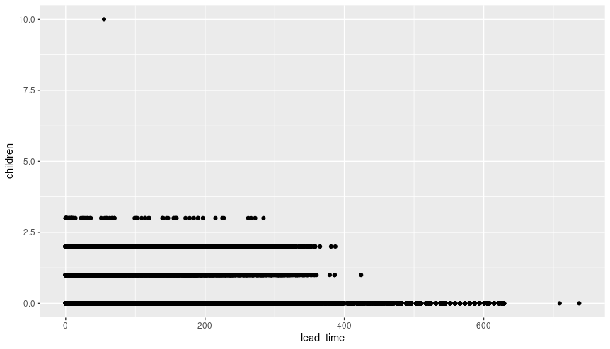
The stakeholder asked about the group of guests who typically make early bookings, and this plot showed that many of these guests do not have children.
Now, the stakeholder wants to run a family-friendly promotion targeting key market segments. She wants to know which market segments generate the largest number of bookings, and where these bookings are made (city hotels or resort hotels). First, I decide to create a bar chart showing each hotel type and market segment. I use different colors to represent each market segment: 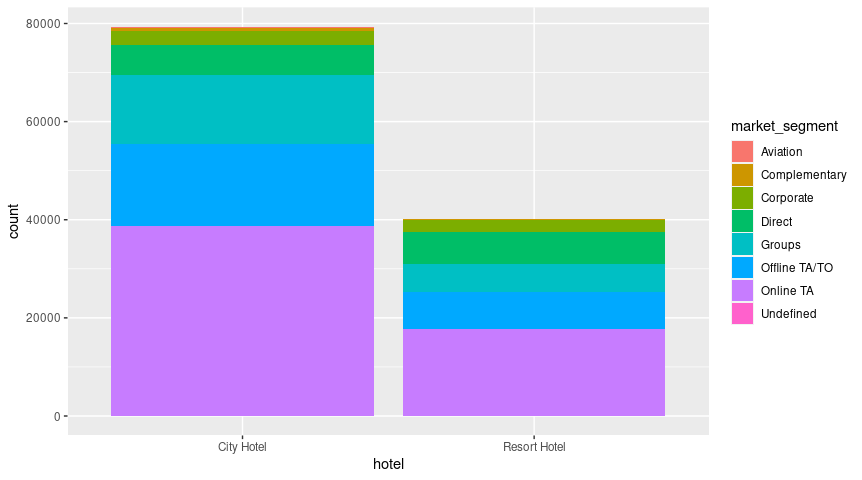
The geom_bar() function uses bars to create a bar chart. The chart has 'hotel' on the x-axis and 'count' on the y-axis. The code maps the 'fill' aesthetic to the variable 'market_segment' to generate color-coded sections inside each bar.
After creating this bar chart, I realize that it's difficult to compare the size of the market segments at the top of the bars. I want the stakeholder to be able to clearly compare each segment. I decide to use the facet_wrap() function to create a separate plot for each market segment. In the parentheses of the facet_wrap() function, add the variable 'market_segment' after the tilde symbol (~): 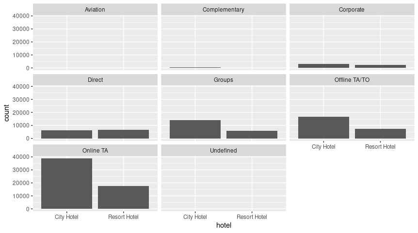
Now I have a separate bar chart for each market segment. The stakeholder has a clearer idea of the size of each market segment, as well as the corresponding data for each hotel type.
Step 5: Filtering For the next step, I will need to have the `tidyverse` package installed and loaded.
After considering all the data, the stakeholder decides to send the promotion to families that make online bookings for city hotels. The online segment is the fastest growing segment, and families tend to spend more at city hotels than other types of guests.
The stakeholder asks if I can create a plot that shows the relationship between lead time and guests traveling with children for online bookings at city hotels. This will give her a better idea of the specific timing for the promotion. I think about it, and realize I have all the tools I need to fulfill the request. I break it down into the following two steps: 1) filtering the data; 2) plotting the filtered data. For the first step, I can use the `filter()` function to create a data set that only includes the data I want. Input 'City Hotel' in the first set of quotation marks and 'Online TA' in the second set of quotations marks to specify my criteria:
Use the`View`() function to check out the new data frame:
There is also another way to do this. I can use the pipe operator (%>%) to do this in steps!
I name this data frame `onlineta_city_hotels_v2`:
Notice how in the code above, the %>% symbol is used to note the logical steps of this code. First, it starts with the name of the data frame, `onlineta_city_hotels_v2`, AND THEN it tells `R` to start with the original data frame `hotel_bookings`. Then it tells it to filter on the 'hotel' column; finally, it tells it to filter on the 'market_segment' column.
This code generates the same data frame by using the `View()` function: 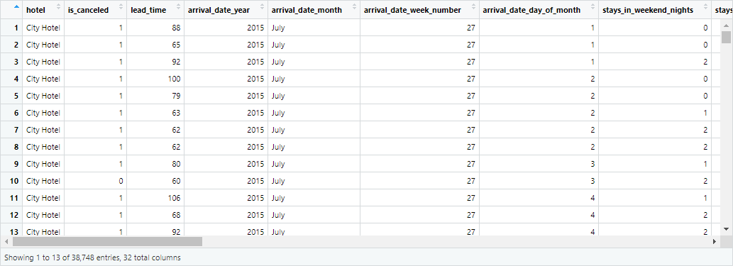
Step 6: Use new dataframe
I can use either of the data frames I created above for my new plots because they are the same. Using the code for my previous scatterplot, replace `variable_name` in the code below with either `onlineta_city_hotels` or `onlineta_city_hotels_v2` to plot the data the stakeholder requested: 
Based on my previous filter, this scatterplot shows data for online bookings for city hotels. The plot reveals that bookings with children tend to have a shorter lead time, and bookings with 3 children have a significantly shorter lead time (<200 days). So, promotions targeting families can be made closer to the valid booking dates.
TAGS :
Comments are closed.
|

ISRIL CANIAGONEED HELP?
Please feel free to reach out to me if you have any questions
Categories
All
|
 RSS Feed
© 2017 Isril Caniago. All rights reserved
