|
The Background
I used to work for a hotel booking company. I have been creating visualizations in `R` with the `ggplot2` package to share insights about the data with stakeholders. After creating a series of visualizations using `ggplot()`, `ggplot2` aesthetics, and filters, the stakeholder asks me to add annotations to the visualizations to help explain my findings in a presentation. Step 1: Import data You can download this data set. In the code below, I use the `read_csv()` function to import data from a .csv in the project folder called "hotel_bookings.csv" and save it as a data frame called `hotel_bookings`:
Step 2: Look at a sample of the data
Use the `head()` function to preview the data:
Use `colnames()` to get the names of all the columns in the data set. Run the code below to find out the column names in this data set:
Step 3: Install and load the 'ggplot2' and 'tidyverse' package
Run the code below to install and load 'ggplot2' and 'tidyverse'.
Step 4: Annotating the chart
The stakeholder tells me that they would like I to create a visualization that compares market segments between city hotels and resort hotels. This will help inform how the company targets promotions in the future. They ask me to create a cleaned and labeled version, so they can include it in a presentation. Here a chart similar to what I created in a previous activity: 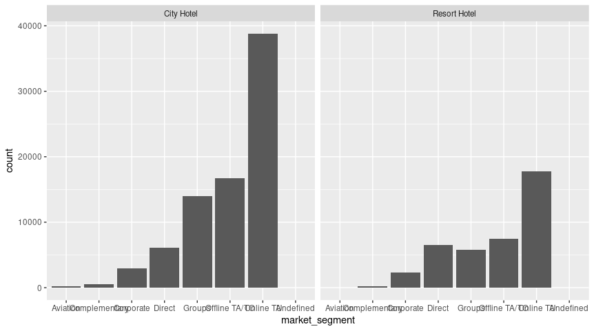
This creates two bar graphs: one for 'city_hotel' data and one for 'resort_hotel' data. The x axis is 'market_segment' and the y axis is 'count' for both charts.
In this visualization it is unclear where the data is from, what the main takeaway is, or even what the data is showing. To explain all of that, I can leverage annotations in `ggplot2`. The first step will be adding a title; that is often the first thing people will pay attention to when they encounter a data visualization for the first time. To add a title, I will add `labs()` at the end of the `ggplot()` command and then input a title there. Add a descriptive title to the code below: 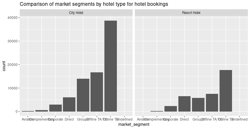
This code will generate the same chart as before, but now it includes a title to explain the data visualization more clearly to the audience.
I also want to add another detail about what time period this data covers. To do this, I need to find out when the data is from. I realize I can use the `min()` function on the year column in the data:
And the `max()` function:
But I will need to save them as variables in order to easily use them in my labeling; the following code creates two of those variables:
Now, I will add in a subtitle using `subtitle=` in the `labs()` function. Then, I can use the `paste0()` function to use newly-created variables in the labels. This is really handy, because if the data gets updated and there is more recent data added, I don't have to change the code below because the variables are dynamic:
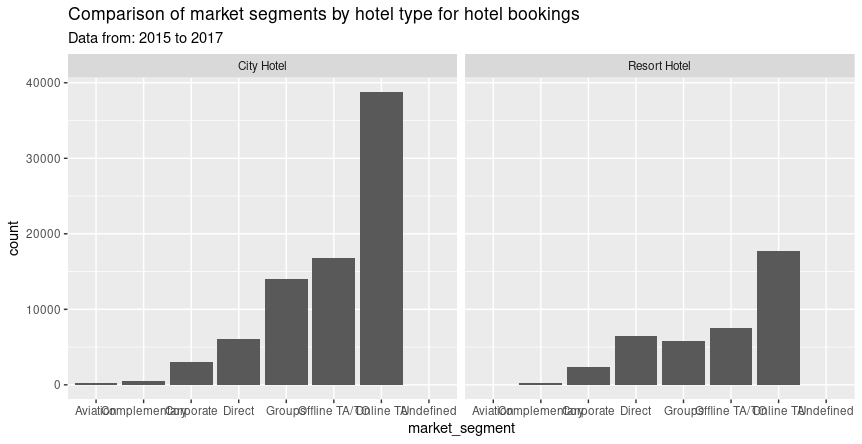
This code will add the subtitle 'Data from: 2015 to 2017' underneath the title I added earlier to the chart.
I realize that this chart is displaying the technical details a little too prominently. I don't want that to be the second thing people notice during the presentation. I decide to switch the `subtitle` to a `caption` which will appear in the bottom right corner instead. 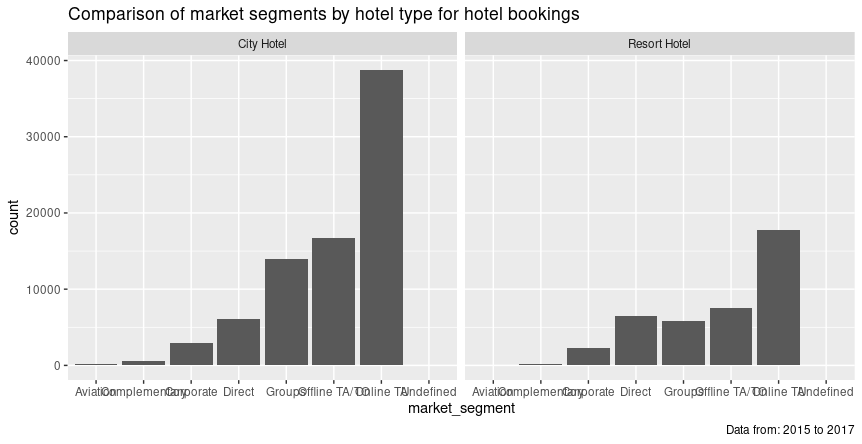
This code makes a slight change to the visualization I created in the last code; now the "data from: 2015 to 2017" subtitle is in the bottom right corner.
Now I want to clean up the x and y axis labels to make sure they are really clear. To do that, I can add to the `labs()` function and use `x=` and `y=`. 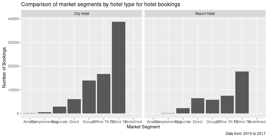
Now I have the data visualization from earlier, but now the x and y axis labels have been changed from 'market_segment' and 'count' to 'Market Segment' and 'Number of Bookings' so that the chart is clearer.
TAGS :
Comments are closed.
|

ISRIL CANIAGONEED HELP?
Please feel free to reach out to me if you have any questions
Categories
All
|
 RSS Feed
© 2017 Isril Caniago. All rights reserved
